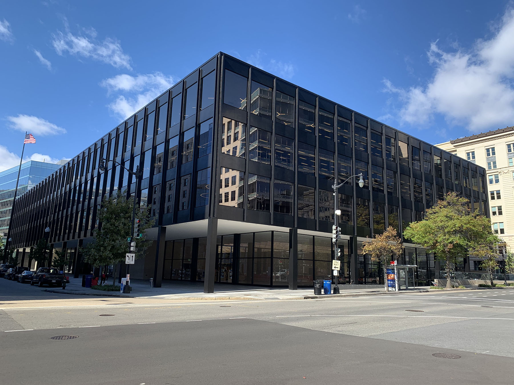
Over the last 12 years, the District of Columbia Public Library has undertaken the renovation and modernization of 22 libraries, including the Martin Luther King Jr. Memorial Library, arguably the most historically significant in the District’s collection. The existing building, designed by celebrated modernist architect Ludwig Mies van der Rohe, was a forgotten gem lost under years of deferred maintenance. After a $211 million makeover, the library reopened to the public in September 2020. At more than 400,000 sq ft, the revitalized building comprises vibrant, open multiuse spaces and a renovated rooftop that offers breathtaking city views. The design team sought to reinterpret one of the modernist movement’s most influential architect’s original designs. This was achieved through careful collaboration among the design team and a deep understanding of the original architecture and structure.
The Martin Luther King Jr. Memorial Library is located at 901 G St. NW in the heart of Penn Quarter in Washington, D.C. Penn Quarter is only a short walk from the National Mall in a commercial district of federal office buildings, high-end restaurants, shops, and cultural institutions.
The existing library was designed by modernist architect Ludwig Mies van der Rohe, opening in 1972. By the early 2000s, it had fallen into such a state of disrepair that there was a movement to sell or demolish the building. Years of deferred maintenance accelerated the deterioration caused by water infiltration at the unique facade joints. This deterioration led to rust jacking of the glass framework and to distortions and cracks in the glazing. At below-grade levels, this water infiltration led to extensive concrete deterioration. In addition, the original mechanical, electrical, and plumbing systems were beyond their service lives and were beginning to fail.
The original interiors were dark and uninspiring and the brick-clad entrances uninviting. In addition, at most floor levels, rows of bookshelves and storage areas had been installed adjacent to windows, which effectively blocked natural light from reaching the interior spaces, where reading areas and offices were once located. Masonry completely enclosed the building’s four cores, creating cramped and dark stairways that were difficult to find. Oddly, the two front cores adjacent to the main entrance serviced building staff, while library patrons had to use the rear cores to get to the upper floors.
Historical significance
Despite the many design criticisms, historic preservation groups fought to save the Mies-designed library, which, interestingly, was the only library in his vast portfolio. It is also one of Mies’ final projects. Adding to the preservationists’ arguments, the building is one of the first to be dedicated to civil rights icon Martin Luther King Jr. These two historical figures may appear to have very little in common; however, the design architects eloquently noted of Mies: “In his work, transparency and light stand as metaphors for freedom and knowledge, the very principles of Dr. King’s life teachings.”
Fortunately, in 2007, the District of Columbia Historic Preservation Review Board designated the library as a historic landmark, and it was placed on the National Register of Historic Places. This paved the way for the $211 million renovation to begin a decade later.
After an international design competition in 2013, Mecanoo, headquartered in Delft, Netherlands, and Washington, D.C.-based OTJ Architects were selected for the redesign.
Mecanoo, led by celebrated architect Francine Houben, is known internationally for its work on libraries. The firm based its design on its philosophy that a 21st-century library should no longer be solely a repository for books but rather a public facility that welcomes all people and provides spaces for learning, collaboration, exploration, and recreation.
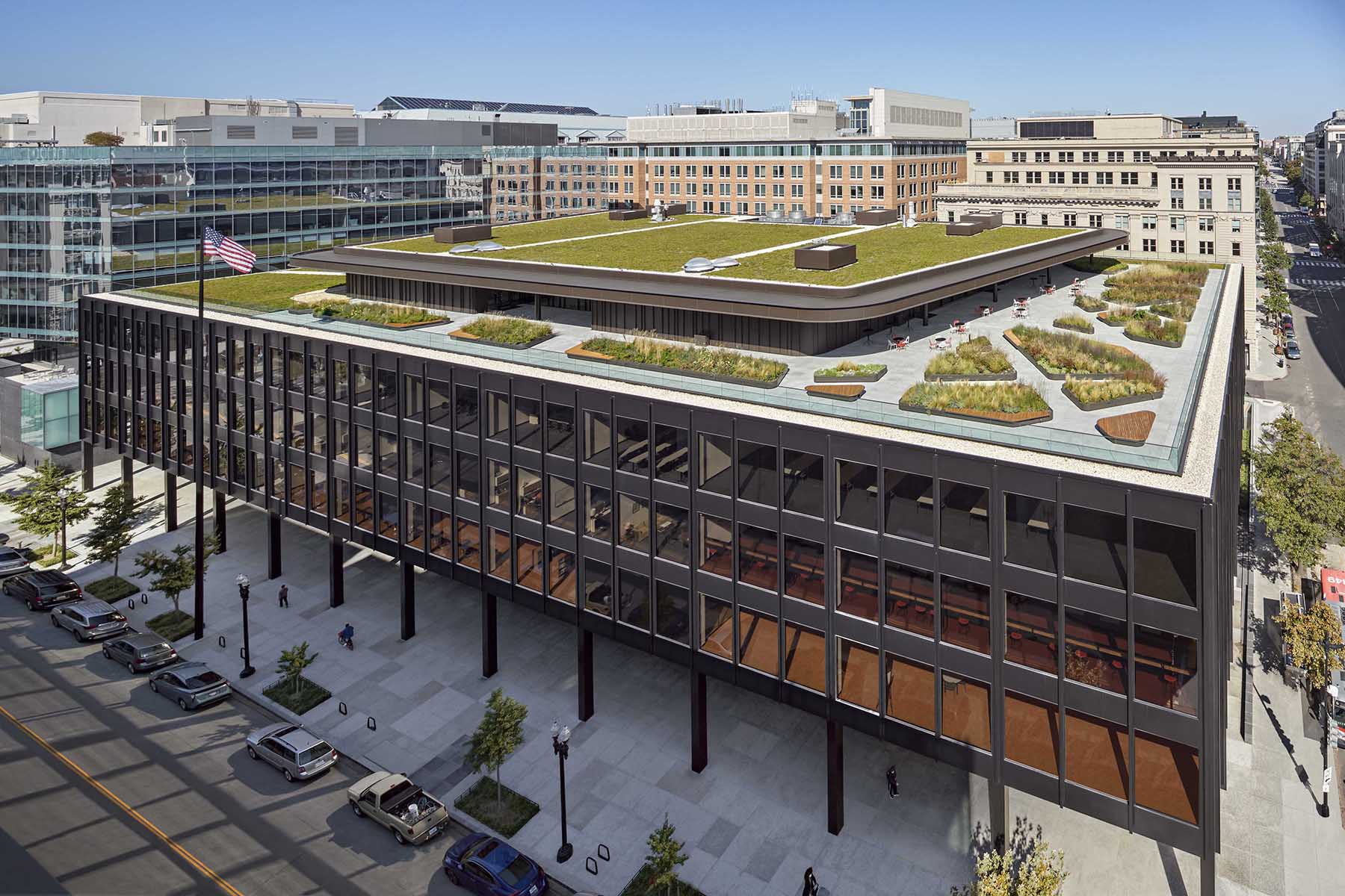
In deference to Mies, Mecanoo clearly differentiated between its new design and the Miesian aspects of the original design. While Mies’ design is distinguished by a disciplined grid of framing emphasizing structure, the new spaces are characterized by rounded forms and accentuated by various colors to create an airy and relaxed atmosphere.
Existing conditions
The building’s form is rectangular with plan dimensions of 180 by 360 ft. Typical column bays are 30 ft in both directions. The exterior of the building is clad in steel and glass with steel mullions spaced 10 ft on center between steel-clad columns every 30 ft.
The original building comprised three levels below-grade and five levels above-grade, including the ground floor and an uninhabitable roof. The foundation consisted of a 6 ft thick mat slab that occupied a portion of the building’s footprint, with the balance supported on piles. The below-grade levels and ground floor were framed with cast-in-place concrete slabs and beams supported by CIP concrete columns and walls. The above-grade superstructure was steel framed with CIP concrete slabs supported by composite steel beams and steel columns.
The existing structure was in good condition except for the exterior steel and glass cladding, which sustained moisture damage from condensation, and the below-grade elements, where waterproofing systems had started to fail.
Facade update
Given the building’s history of facade problems and that facade’s significance as a character-defining feature, a substantial portion of the work for the building involved the rehabilitation of the envelope system. Modern sustainability requirements for thermal performance also mandated an upgrade of the envelope, and the original steel anticorrosion coating needed to be replaced.
Facade consultant Wiss, Janney, Elstner Associates Inc. surveyed the condition of the envelope and tested the existing coatings. The testing informed their plan for preparing the surfaces for the application of new coatings.
Additionally, single-pane glazing was replaced with laminated glazing. The exterior panes have a clear low-emissivity coating that improves thermal performance, while the interior panes are tinted bronze.
Protected elements
Because of the building’s landmark status, there were elements and features that were historically significant, including the first-floor brick masonry as well as the MLK mural and the supporting brick masonry directly behind it. The mural, which depicts events of King’s life and the civil rights movement, was installed in 1986 in celebration of the first MLK holiday adopted by Congress. The 7 by 56 ft mural is centrally located in the Great Hall, and it is immediately visible upon entering the main entrance. The mural spans two structural bays.
Directly in front of the mural, the new design called for an informal performance space with an alcove below the mural for a stepped seating area. This required the demolition of the masonry wall below the mural, which was temporarily relocated during construction. In addition, the upper portion of the wall behind the mural was needle-shored for its protection before the demolition of the lower portion.
To support the wall in its final condition, Silman, the structural engineering firm for the project, designed supports to span between the existing columns and a central intermediate support from above. The support from above would limit deflection of the masonry at the midspan of the horizontal hollow structural steel elements. The existing second-floor beam directly above could not support the central support load, so a V-shaped truss system was designed instead. Two diagonal HSS members diverge from the center of the HSS beam up to the columns on either side of the bay.
Adding to the complexity, the support system needed to be offset to be clear of the masonry wall it was supporting, it needed to fit within the architecture, and it had to limit any disturbance of the remaining masonry wall. To support the offset masonry wall, a continuous plate and HSS tube outrigger system, spaced 2 ft apart on center, were welded to the bottom of the HSS beam. The system was designed to cantilever and support the entire width of the masonry wall.
Lateral system
An initial study was conducted to determine the lateral load-carrying capacity of the existing structure. Based on the existing structural drawings as well as probes that Silman conducted, the engineers determined that lateral resistance was provided by moment-frame action in the structure combined with the resistance of interior infill masonry walls. The existing drawing details of the spandrel beams at the column joints showed top bars in the slab welded to the columns. These columns had continuous steel fascia plates that were anchored into the concrete encasement of the steel. These details resulted in continuity through the joint, creating moment-frame action.
Other probes were conducted on the detailing at the base of the columns to determine the degree of fixity. Ultimately, the analysis showed that the existing lateral capacity would not meet wind and seismic demands dictated by current codes.
Additional analyses were conducted with new concrete walls placed at all four cores, extending from the foundation to a new roof addition. The dual system of moment frames and concrete shear walls provided adequate resistance and stiffness for the new lateral loads.
Cores and monumental stairs
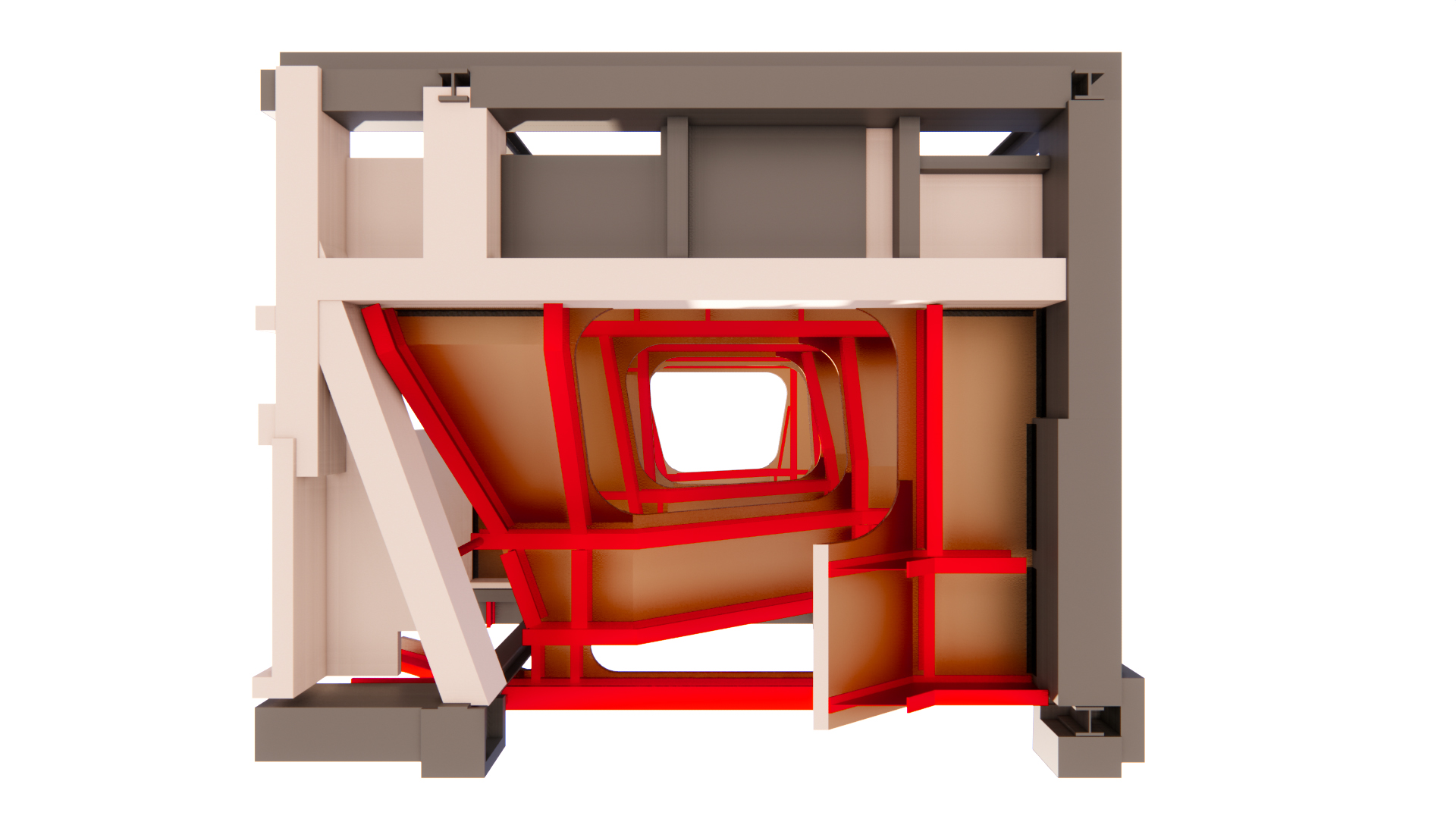
The mural was not the only historically significant element. Much of the existing brick masonry veneer at the first floor — along with its concrete masonry unit backup — and at the four cores on all levels qualified for preservation. At all levels of all four cores, the architectural programming required a complete reframing of the structure. However, the existing beams directly below the protected walls needed to remain in place. The framing surrounding these protected walls was demolished for the new design. The existing framing that supported these walls was supported by a complex web of new framing.
 Edit photo credit]
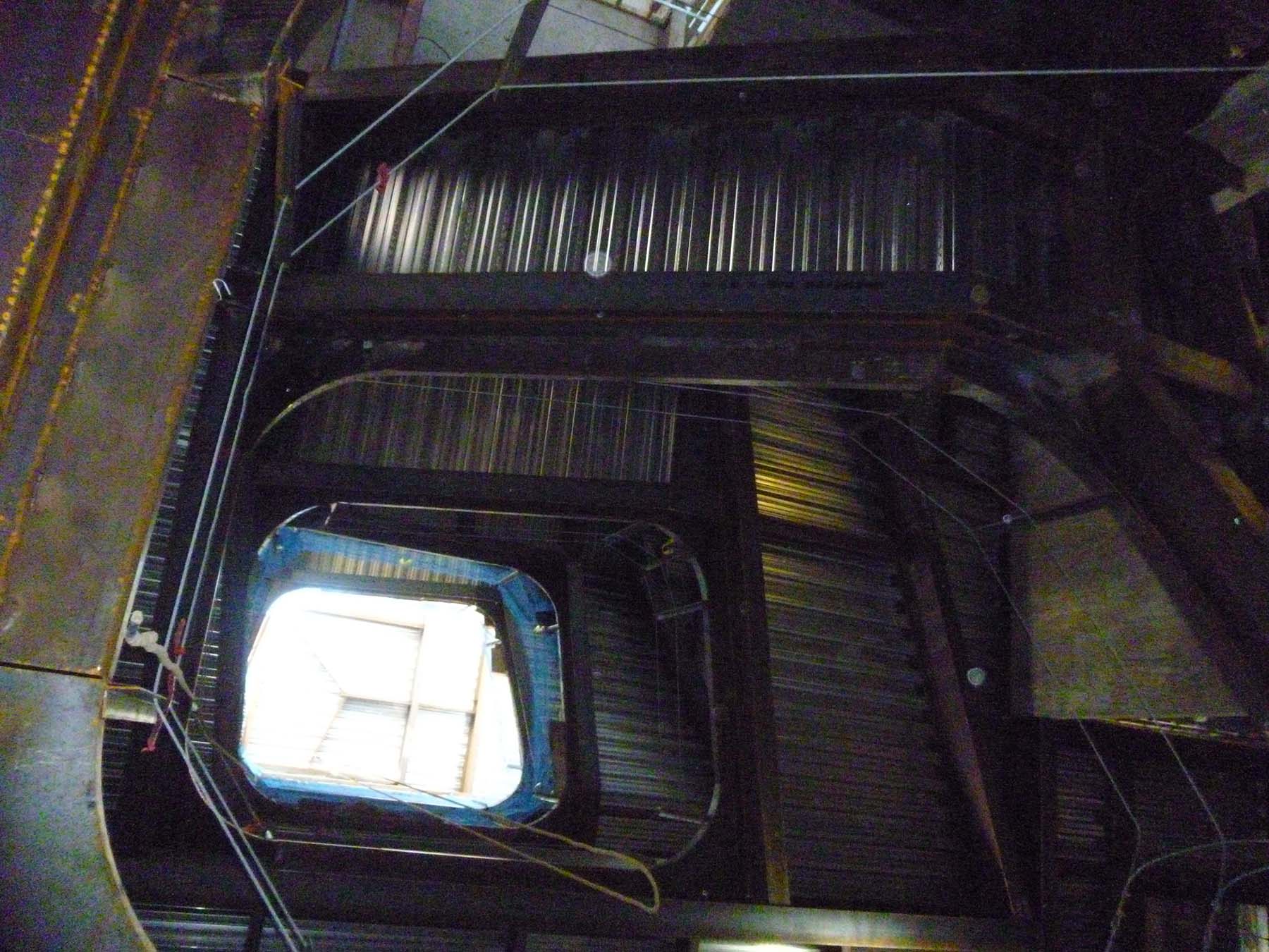
 Two new helical-shaped monumental stairs were designed within the two southern cores to flank the main public entrance at the first floor and provide access between the first below-grade level and the existing roof level. At the new roof, the design team added a skylight to allow natural light to enter the shaft. The stairs are identical and mirrored along the central axis of the building.
The stairs’ widths vary from 5 to 6 ft and allow for the designer’s vision of a “social stair” that provides patrons with a meeting point rather than just circulation. The helical shape shifts at each level to provide unique views of the stairs as well as views of patrons descending and ascending the stairs below.
The stair structure comprises standard rolled-steel shapes supported by new beams within the cores and existing beams located along the perimeter of the cores. The stair landings between floors are supported by HSS posts and exposed plate hangers that are tied to the existing perimeter beams. The hangers are 0.5 by 2 in. plates that have been carefully integrated into the handrail system.
At the second floor and above, some of the existing perimeter beams required reinforcement, which was achieved by welding WT reinforcement to the bottom flange of the existing beam. At the concrete-framed levels, support points were strategically located to avoid reinforcement of the existing concrete beams.
A vibration study was conducted to meet appropriate criteria for comfort.
New spaces
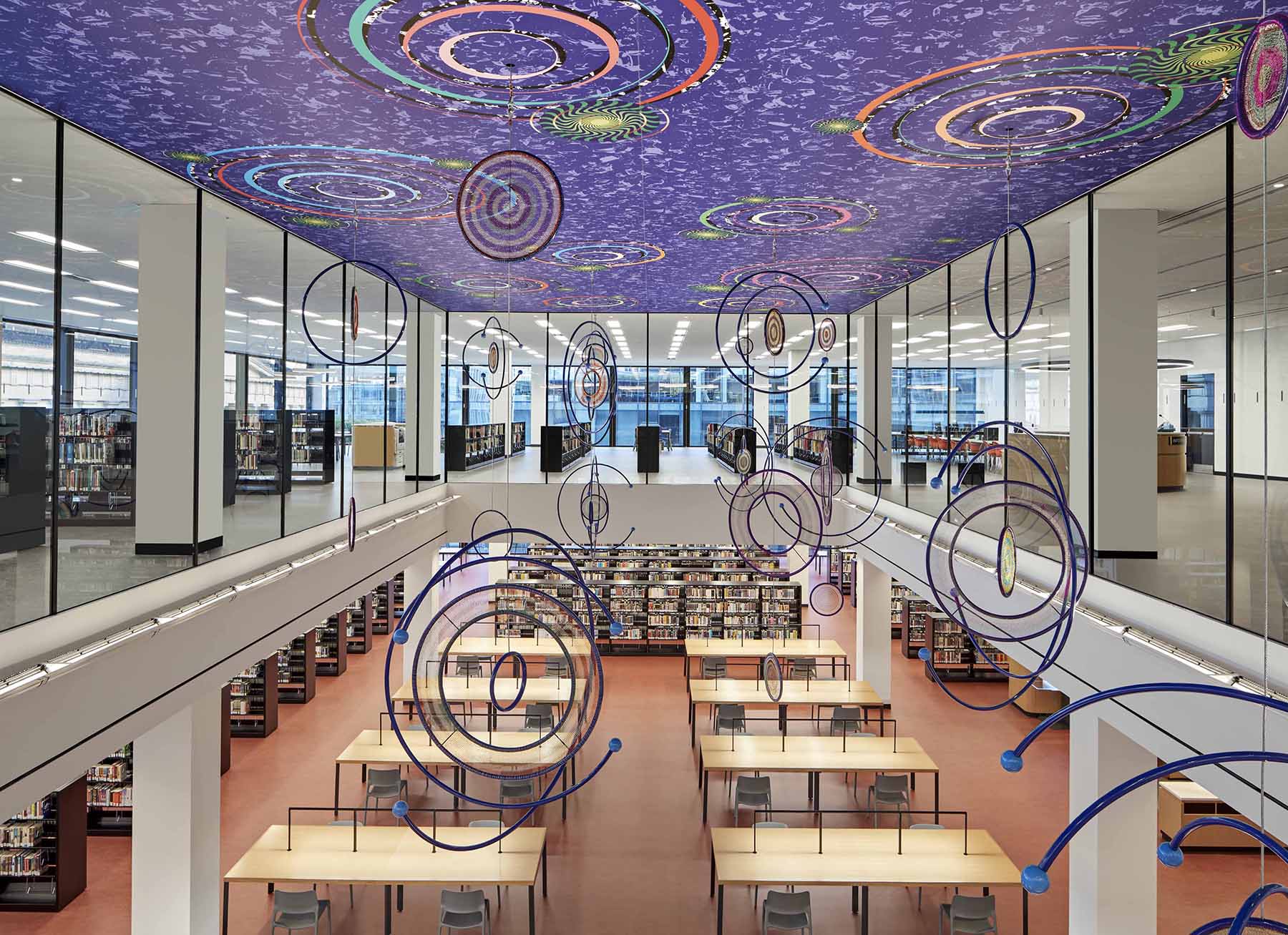
The design team wanted to have high ceilings — such as those found in the great libraries of the past — in the new Great Reading Room. To make that happen, the reading room was placed on the east side of the third floor. This required the demolition of a two-bay section (30 by 60 ft) of the fourth-floor framing directly above to carve a two-story space out of the upper floors.
Demolition was limited to the concrete floor plate and one steel beam along the grid that divided the two bays. The edge of the opening is 2 ft from the grid, resulting in a cantilevered slab. To support this cantilever, the existing slab reinforcement was protected during demolition and was bent to develop the bars in tension. New steel edge angles and headed studs were cast to form the new slab edge and to support floor-to-ceiling glass walls that provide views into the reading room below.
A new 289-seat auditorium is located at the center of the roof between the four cores. It replaces the original one-story below-grade auditorium. It is a double-height space between the fourth floor and the new rooftop addition. The auditorium is designed for performances and lectures and has direct access to the rooftop, adding to the value of the library as a community space.
Construction of the auditorium required the demolition of roughly 60 by 50 ft of roof framing. The auditorium seating is steel framed with seven lines of sloped steel beams supported by posts. The posts bear on the existing 60 ft span composite 30WF steel beams at the fourth floor. The original design of the floor system specified a live load of 150 psf; therefore, reinforcement of the existing beams for the new loads was not required.
The main function of the rooftop addition is to house the new auditorium. There are also flexible event spaces, a kitchen, a cafe, and staff lounges. The rooftop addition is a single floor that is set back from the existing building line due to zoning requirements.
The design also makes room for a full floor addition in the future. To accommodate this, the existing roof structure was designed for a live load of 150 psf and is similar in composition to the floors below. The new rooftop structure consists of concrete on a composite steel deck supported by composite steel beams and steel columns. Careful planning and coordination of the location and size of vegetated and occupied areas enabled the design team to minimize costly reinforcement of the existing roof structure.
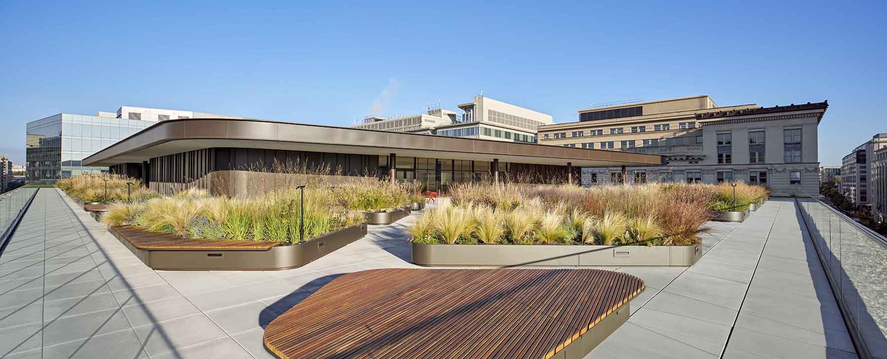
The new columns are typically spaced to align with the existing steel columns, with six exceptions. These six columns are transferred by the existing composite girders, which were the only six existing roof beams requiring reinforcement.
The design team incorporated a slide into the program south of the eastern core between the second and first floors. Located within the children’s reading area, the slide is a playful element that enhances the idea that this library is more than just a place to store books but rather one that allows young patrons to engage with the built structure.
The slide is primarily supported by sloped W18 beams that are tied to existing steel at the second floor and supported by steel posts that bear on existing first-floor concrete beams.
The Martin Luther King Jr. Memorial Library has been sensitively restored and adapted by the design team led by Mecanoo and OTJ Architects. Silman addressed the structural challenges through a series of preservation-sensitive interventions, using the original structure to its fullest extent. The renewed midcentury modern building — by one of the masters of the modernist movement — provides a reinvigorated community resource for Penn Quarter.
PROJECT CREDITS
Design architect: Mecanoo, Delft, Netherlands
Architect of record: OTJ Architects (formerly known as Martinez + Johnson Architecture), Washington, D.C.
Landscape architect: Oehme, van Sweden & Associates, Washington, D.C.
General contractor: Joint partnership of Smoot Construction, Washington, D.C., and Gilbane, Arlington, Virginia
Structural engineer: Silman, Washington, D.C., office
Building enclosure consultant: Wiss, Janney, Elstner Associates Inc., Falls Church, Virginia
Mechanical, electrical, plumbing engineer: Collaborative Engineering Group, Houston
Fire protection engineer: Engenium Group, Washington, D.C.
Civil engineer: Wiles Mensch Corp., Reston, Virginia
This article first appeared in the July/August 2021 issue of Civil Engineering as “Reinvented Space.”


