By Richard Koehler, Ph.D., P.H., A.M.ASCE, M.EWRI
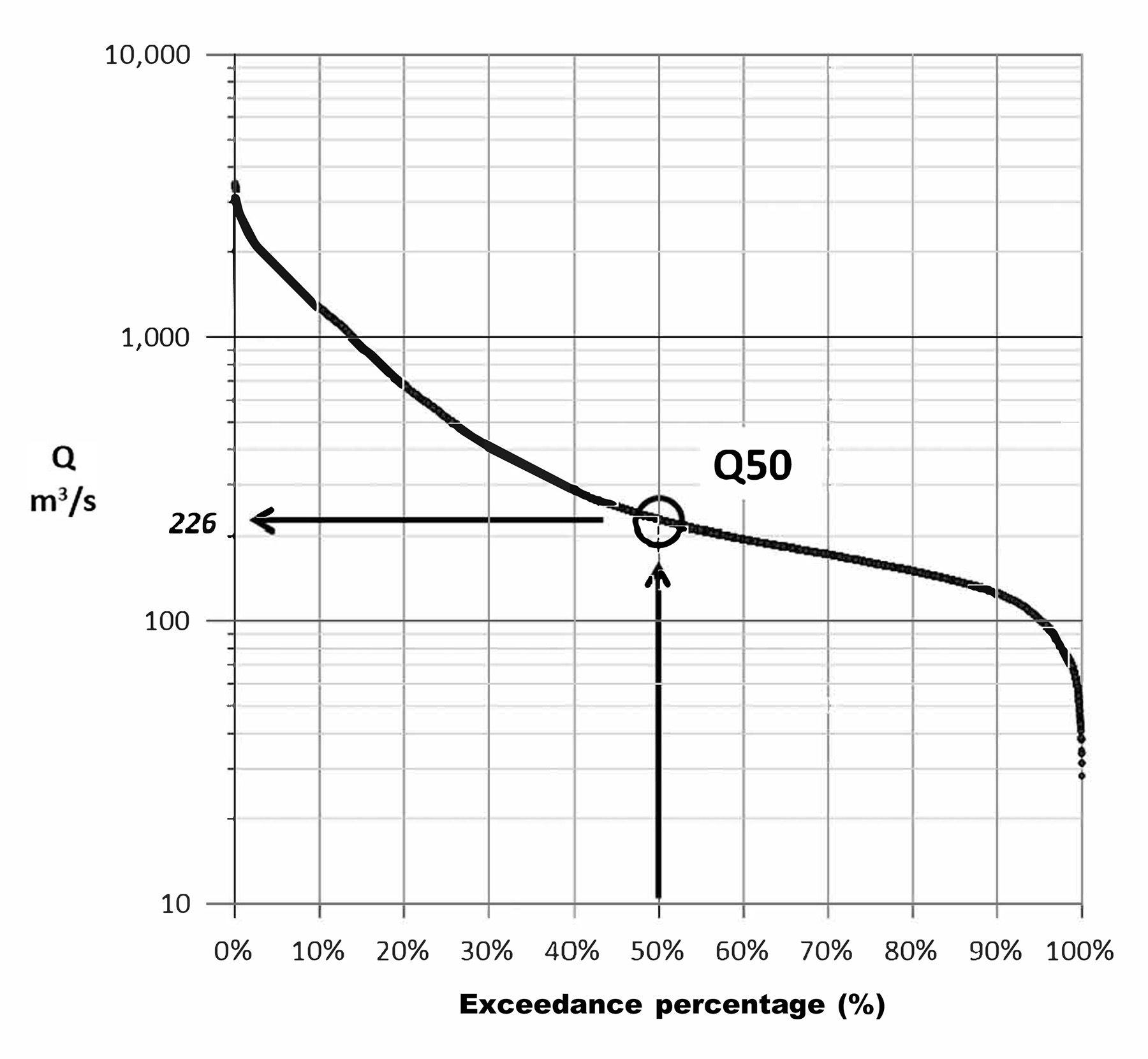
When starting water resource projects, engineers and water resource professionals often begin with determining the flow duration curve for streams of interest — a technique that has been in widespread use since about 1915 (Searcy, 1959). The FDC shows how much of the streamflow record is equal to or greater than a specified discharge. For instance, the Q10 discharge refers to a flow that is equaled or exceeded 10% of the time. Similarly, the Q50 discharge is the median flow.
The FDC provides a flow-frequency magnitude relationship regardless of the data configuration (Figure 1). A key point is that each specific flow level has a specific corresponding exceedance percentage. The result is that an FDC can never include a truly vertical or truly horizontal section. It also means the range of flows with the greatest number of observations will make up the flattest section of the curve when using a linear x-axis scale.
There are tools to create FDCs. Two examples from the U.S. Army Corps of Engineers’ Hydrologic Engineering Center are the Statistical Software Package and the Ecosystem Functions Model, both freely available. Additionally, many colleges and universities have published YouTube tutorials on FDC creation.
Unfortunately, these tools and tutorials do not address FDC limitations. These limitations prevent full access to valuable information and hide many useful streamflow patterns and properties. Having access to this knowledge can lead to an expanded understanding of flow regimes, improved project designs, and better monitoring of project objectives.
Data visualization
While an FDC has no timing information, it is still possible to examine discharge changes over time by using annual FDCs. Figure 2 shows how the annual FDCs can be displayed in a 3D format highlighting the Q10, Q50, and Q90 values. Plot axes are flow, exceedance percentage, and water year. From this plot, the 3D lines and points can be projected onto the side walls.
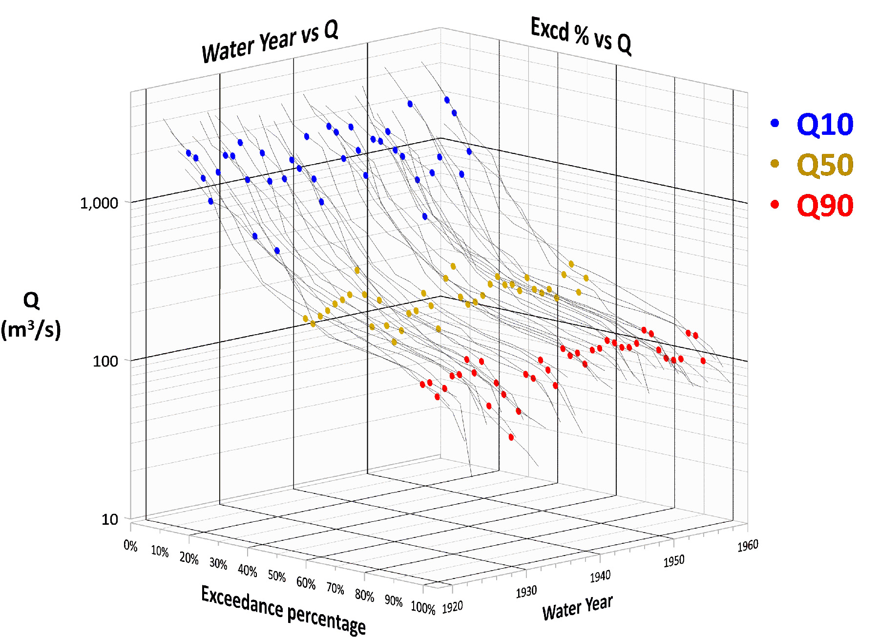
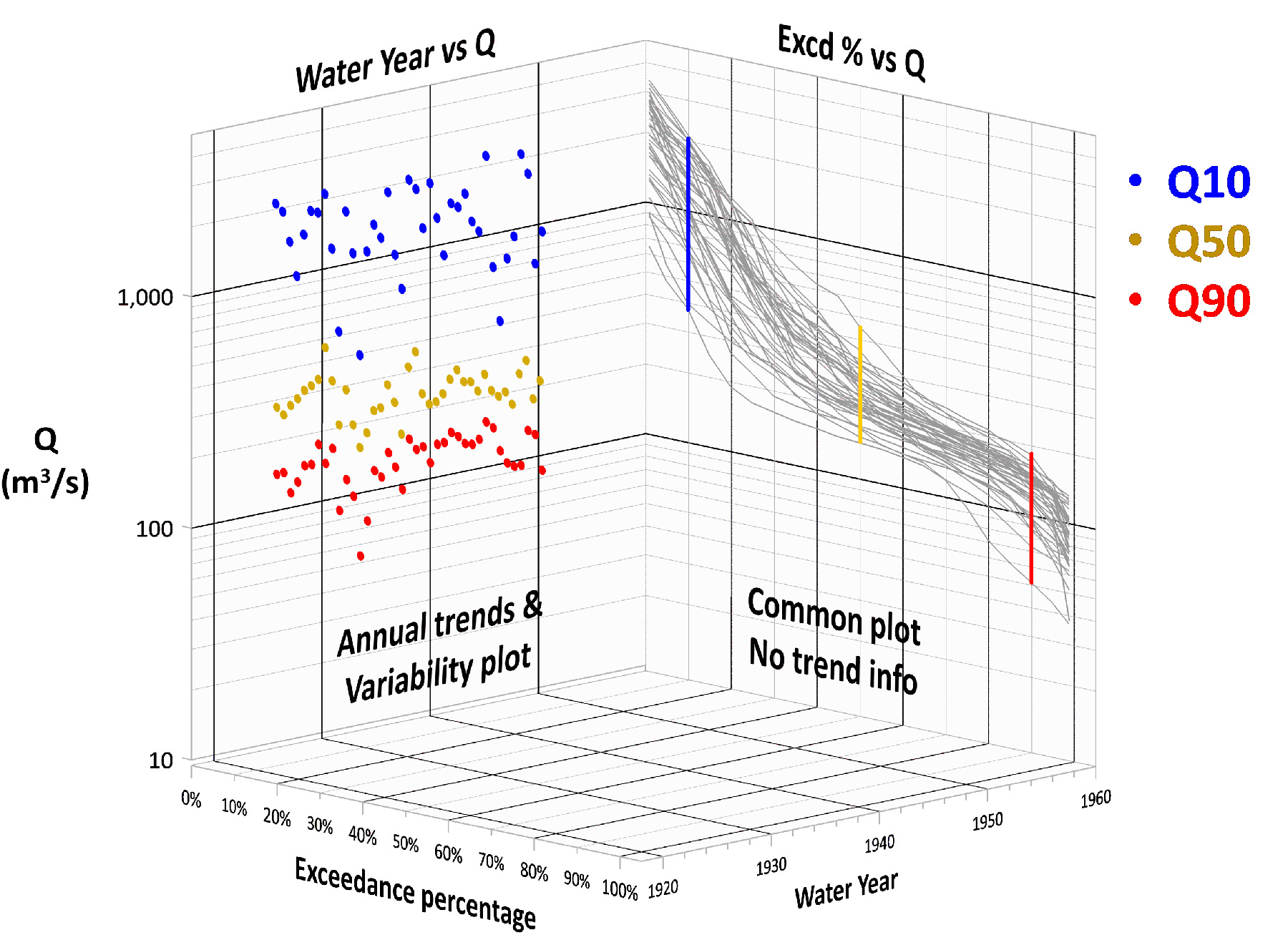
Figure 3 shows how a change of viewpoint can unlock existing information. The right wall is the status quo on how annual FDCs are typically graphed — a spaghetti plot of annual curves. The limitation is that yearly recognition is lost within the jumble of lines. Instead, consider the left wall perspective. This alternative approach uses Q10, Q50, and Q90 values for each water year to show trends and data variability.
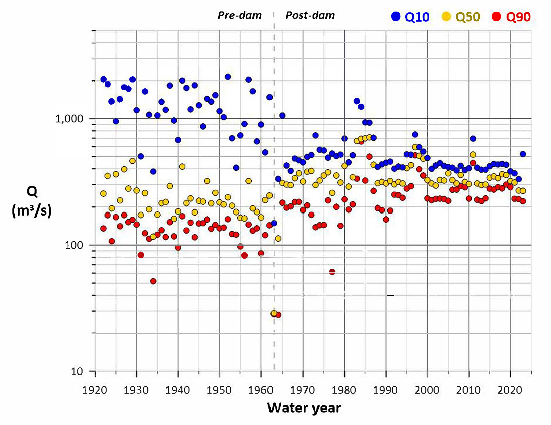
Using the left wall approach, Figure 4 shows annual FDC points for the Colorado River before and after the construction of Glen Canyon Dam. Before 1963, the river was unregulated, with data showing a large flow range. After 1963, dam releases caused the range and variability of flows to be modified considerably.
Data order
Another important FDC limitation is the lack of chronological sequence information, meaning there is no way to know if adjacent points on the curve are one day or decades apart. This is because the curve is based solely on the composition and not the configuration of streamflow data. Displaying sequencing information requires knowing and using data order.
Here is an example. Figure 5 shows three hydrographs, all with the same data composition. The first hydrograph (blue) uses observed data from the Merced River at Yosemite, California. The second hydrograph (red) is a highly ordered data display. The third hydrograph (green) is a randomized data display and is shown as points.
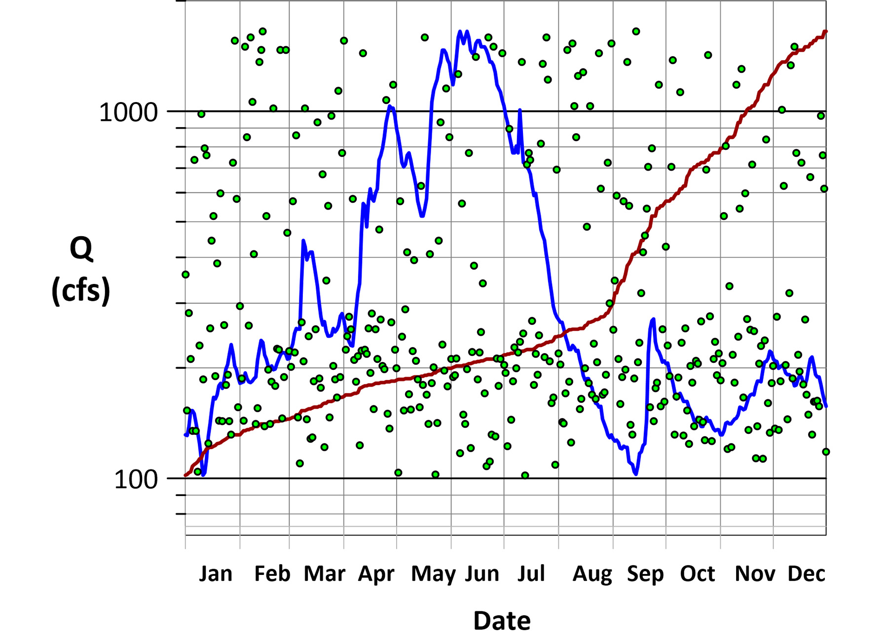
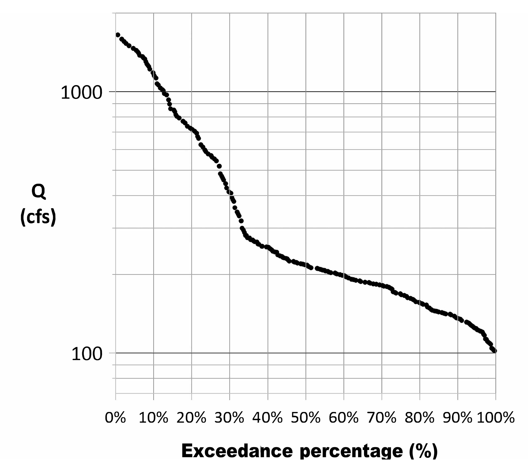
These hydrographs show vastly different streamflow patterns. The highly ordered flow example (red) is extremely persistent, while the random flow example (green) is extremely flashy. The FDCs of all three hydrographs are shown in Figure 6 and appear as a single curve because the data composition is identical for all three cases. It is only the data composition that affects the curve shape.
Two key points to consider:
- Hydrograph persistence or flashiness has no effect on the shape of the FDC.
- Identical data composition yields identical FDCs, regardless of data order.
Combinations and permutations
Comparing FDCs to hydrographs is like comparing combinations (where order is not a factor) to permutations (where order is a key factor). The calculations below emphasize this difference.
Example: Assume a flow dataset with 365 unique streamflow values.
Number of different FDCs = number of combinations: 365C365 = 1
Number of different hydrographs = number of permutations: 365P365 = 2.5 x 10778
For comparison, astronomers estimate the number of protons in the universe (the Eddington number) to be about 10.80
The implications are:
- FDCs are not unique to any single hydrograph.
- FDCs should not be used in model calibration involving specific hydrographs.
Other factors
The FDC is a type of no-shift lag (0) autocorrelation scatterplot, when a time-series is compared to itself. Regardless of the randomness or persistence of the source data, the result is always a single line with no data point scatter. For FDCs, a flow dataset is transformed into an exceedance percentage, which is then compared back to the original flow dataset. Think of this as being like a lookup table in a spreadsheet.
This brings up another issue. Some FDC graphs use a probability scale for the x-axis. However, because of persistence, this practice may be problematic, as daily streamflow data are not independent and identically distributed, a key factor for the probabilistic treatment of data. Indeed, engineers and water resource professionals know that persistent data cannot be treated as random. Yet the FDC functions this way. Persistent data and random data are treated the same, so it is impossible to know data configuration when examining an FDC by itself. Thus, this article only uses an exceedance percentage scale for the FDC x-axis, which is consistent with the graphing practices of the U.S. Geological Survey.
The modernized FDC
On its face, addressing the limitations of FDCs can seem daunting.
- FDCs are not unique to a single streamflow dataset.
- Without temporal order, the FDC cannot provide information on streamflow timing, duration, autocorrelation (the degree of persistence or randomness within a dataset), hydrograph shape, or changes in flow.
- FDCs can mislead because the autocorrelation structure of the streamflow series is effectively removed (Vogel & Fennessey, 1995).
The solution involves combining two common data analysis methods — the one-day shift lag (1) autocorrelation scatterplot and the FDC itself. Not only are limitations addressed, but additional information becomes accessible (Koehler, 2023).
Data preparation and informational design
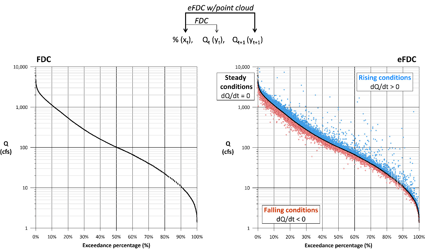
Figure 7 shows FDC data as the left two columns, an exceedance percentage (x) and the flow Q (y). Data are shown in chronological order, though this does not affect the FDC. The figure also shows data for an “enhanced” FDC (eFDC) that has an extra y column for the next day’s flow. This new column shows lag (1) data and uses a one-day shift that repurposes existing flow data.
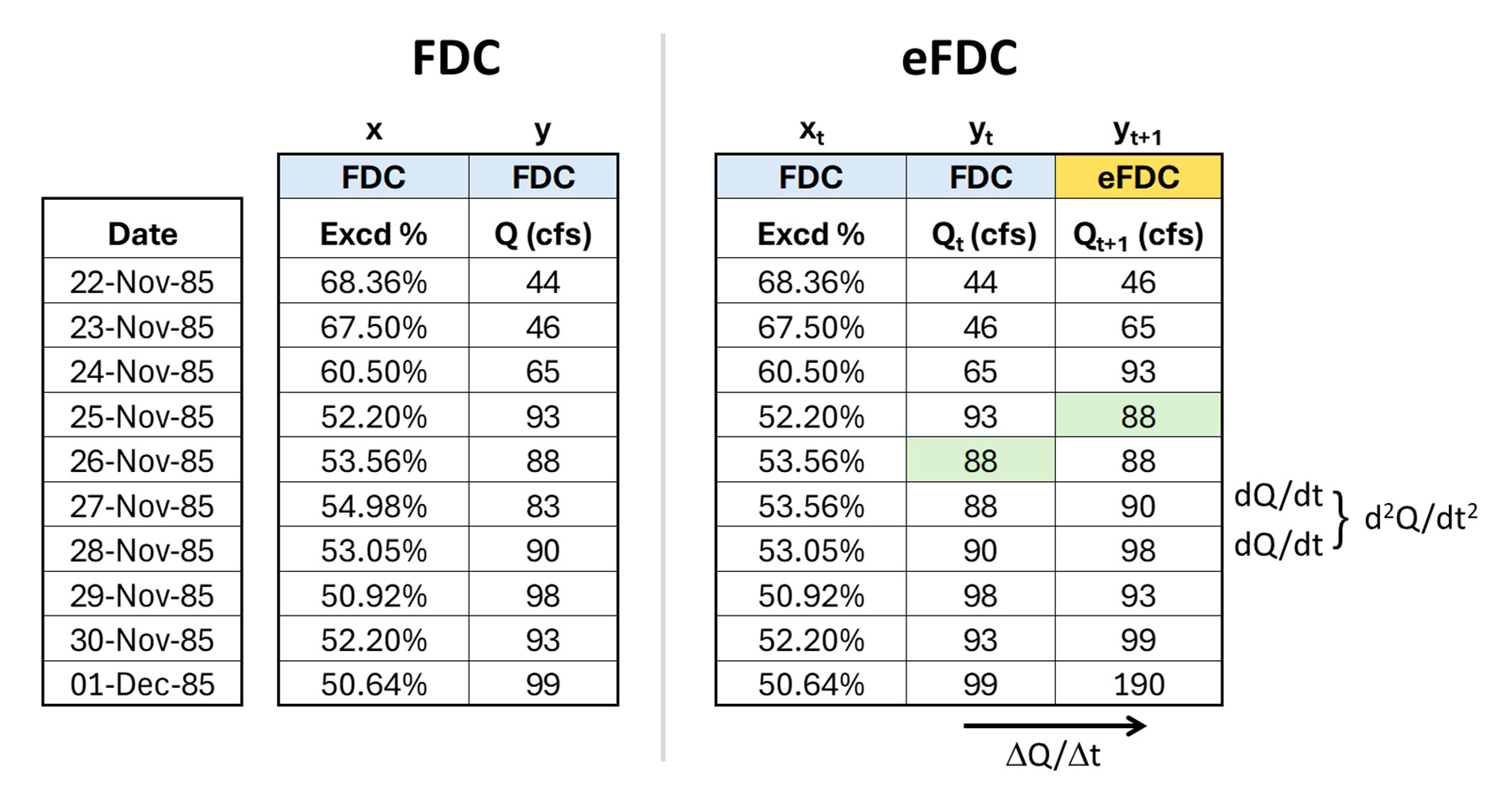
The eFDC y columns can be considered Qt (yt) and Qt+1 (yt+1). It is critical that flow data are in chronological order so that the shift represents a one-day change. The inclusion of this extra column enables multiple types of information to be displayed.
As seen on the right side of the tables, this extra column for the eFDC defines the daily change in flow. When graphed, the Qt+1 value is placed directly above, on, or below the Qt value, as both use the same exceedance percentage axis coordinate for Qt.
Another benefit is that the first- and second-order derivatives of the flow (dQ/dt and d2Q/dt2) are displayed on the eFDC plot, something not possible on the traditional FDC.
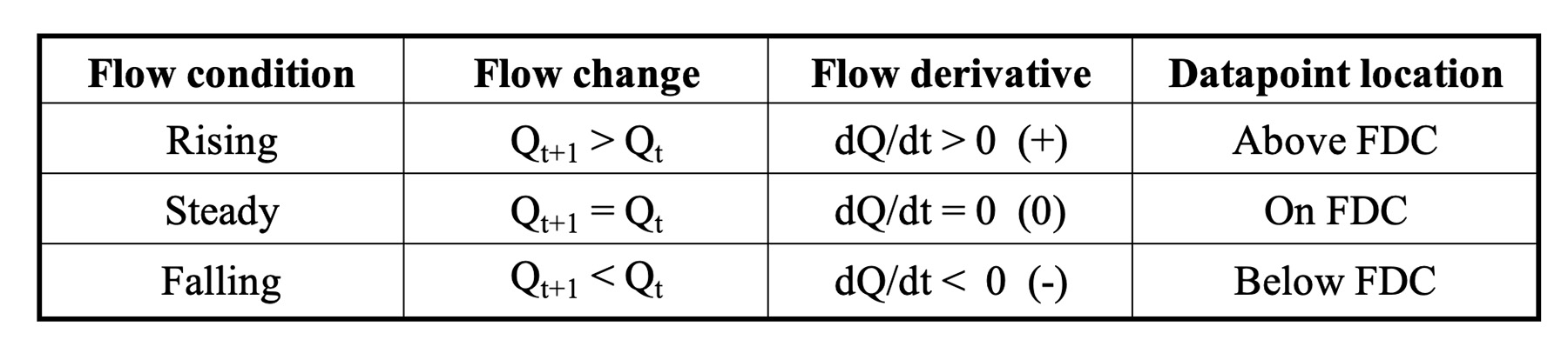
A point cloud (a dQ/dt hydrograph) can now be created where all rising flows are above the FDC, all falling flows are below the curve, and any flows that are staying the same fall on the curve (Figure 8). These regions are summarized in Table 1. Because the point cloud is an expression of a specific dataset, the eFDC now becomes unique to that dataset. The FDC uniqueness limitation discussed earlier has been addressed.
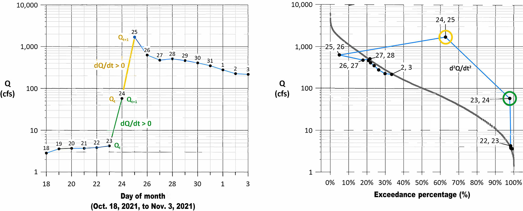
A comparison of a traditional and a dQ/dt hydrograph is shown in Figure 9. The graphs show how hydrograph slopes in a classic plot are equivalent to point values in the dQ/dt hydrograph. The new plot allows for single hydrologic events to be integrated into and compared within the FDC. Again, this is something the typical FDC cannot do.
Finally, the point cloud can be turned into a matrix. Using a histogram bin spacing based on the exceedance percentage scale, the observed Qt and Qt+1 values are reclassified into discrete flow categories. A summary count for each (exceedance percentage, Qt+1) category pairing was determined. The result is shown in Figure 10.
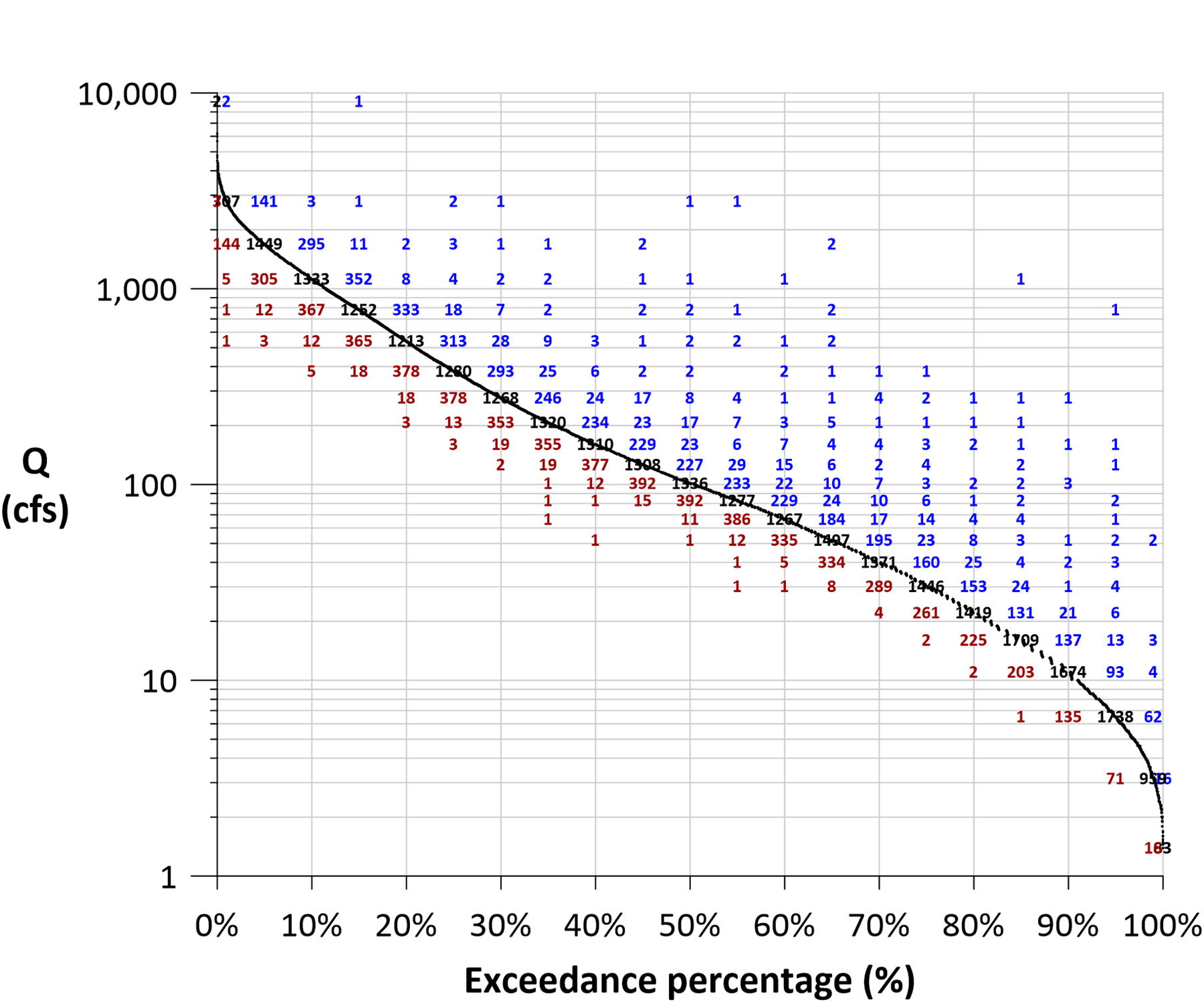
The usefulness of this matrix is far reaching. For example, flow levels such as the Q10 are no longer a single, isolated value. Now the number and degree of the next-day flow changes for the Q10 condition can be quantified. Just as easily, the number and degree of antecedent flow changes for the Q10 condition can also be quantified. Neither of these insights is possible with a traditional FDC. This could be helpful when planning projects.
Next, the scatter of the point cloud provides a visual way to assess the persistence or flashiness of the flow regime. When data points or matrix values cluster closer to the FDC, more persistence is present in the dataset (higher autocorrelation). Similarly, when points or values are widely scattered, more randomness exists within the dataset (lower autocorrelation). These conditions can be visually examined at any flow level.
In another example, if a simulation model requires calibration, the matrix provides a way to examine model performance for all flow conditions, not just maximums or minimums but also all rising limbs, falling limbs, or periods of steady flow. Just as helpful is using the matrix as part of a model sensitivity analysis to better understand how parameter changes affect output.
One final example is the monitoring of water quality through total maximum daily loads, which are based on FDCs. It is now possible to have enhanced load duration curves for TMDLs.
Summary
This article presents fresh insights into the traditional FDC. After examining the limitations, the article describes a simple methodology that expands the FDC into new and useful directions. New analysis approaches and visualization options are discussed.
The goal of this author is to improve water resources management and give engineers, hydrologists, and other professionals new tools and approaches while encouraging them to go beyond the status quo.
Richard Koehler, Ph.D., P.H., A.M.ASCE, M.EWRI is the CEO at Visual Data Analytics LLC.
This article first appeared in the March/April 2025 issue of Civil Engineering as “Modernizing the Flow Duration Curve.”
Applications
Data preparation: MS Excel (version 2411, build 18227.20162)
Data visualization: Golden Software Grapher (version 23.2.269)
References
Koehler, R. (2023). Quantifying streamflow properties using a calculus-based differential approach. Ecohydrology, 17(4), e2597. https://onlinelibrary.wiley.com/doi/full/10.1002/eco.2597
Searcy, J. K. (1959). Flow-Duration Curves (Report No. 1542-A). U.S. Government Printing Office. https://pubs.usgs.gov/wsp/1542a/report.pdf
Vogel, R. M., & Fennessey, N. M. (1995). Flow duration curves II: A review of applications in water resources planning. Journal of the American Water Resources Association, 31(6), 1029-1039. https://sites.tufts.edu/richardvogel/files/2019/04/flowDuration2.pdf
Want more information? Check out a new on-demand course at go.asce.org/flow_duration
